Code
data_tb %>%

    ggplot(mapping = aes(x = time, y = growth)) +

geom_plot()ggplot2 is a Tidyverse package for creating plots based on the “grammar of graphics”. The minimal requirements to create a ggplot2 object are:
A generic ggplot2 code template is shown for a fictitious scatterplot of variables called time and growth in a tibble called data_tb. Notice that geoms are added with a plus sign and are not contained within parentheses of the ggplot() command. Adding white space for readability is optional.
data_tb %>%
ggplot(mapping = aes(x = time, y = growth)) +
geom_plot()The mapping = , x = , y = argument names are often omitted, because these arguments are easily inferred from code. The shorter version is shown below.
data_tb %>%

    ggplot(aes(time, growth)) +

    geom_plot()
ggplot2 offers many options to customize nearly everything about a plot. In this lesson we introduce staple plots in biological research with minimal code. In the subsequent lesson we present additional features most commonly added to these and other plots.
Import data for graphing:
In the code below (click triangle to view) we import data from Friends_Cholesterol.csv and CAMP_3280.csv, fix a few problems, and name the tibbles tb_chol and tb_camp.
library(tidyverse)
rm(list = ls())

tb_chol <- read_csv(file = "data/Friends_Cholesterol.csv",
               col_types = "cnfnfnnnnnn") %>%

    rename(first_name = name,
           sex = gender) %>%

    mutate(sex = fct_recode(sex,
                            'male' = '0',
                            'female' = '1'),
           group = fct_recode(group,
                              'control' = '0',
                              'statin' = '1')) %>%

    pivot_longer(cols = 6:11,
                 names_sep = "_",
                 names_to = c(".value", "timepoint")) %>%

    mutate(timepoint = factor(timepoint),
           timepoint = fct_recode(timepoint,
                                  "initial" = "i",
                                  "final" = "f"))

tb_camp <- read_csv("data/CAMP_3280.csv") %>%

    mutate(ETHNIC = fct_recode(ETHNIC,
                               "black" = "b",
                               "white" = "w",
                               "hipanic/latino" = "h",
                               "other" = "o"),
           GENDER = as.factor(GENDER),
GENDER = fct_recode(GENDER, "female" = "0", "male" = "1"))Scatterplots require numeric variables on the x and y axis. A regression line is added with geom_smooth() and the arguments shown below. "lm" stands for linear model and just indicates a straight line. se = determines if standard error bars are included on the plot.
tb_chol %>%

    ggplot(aes(height, weight)) +

    geom_point() +

    geom_smooth(method = "lm",
                formula = y ~ x,
se = FALSE) geom_bar plots frequencies (counts) when provided with a single factor variable.
tb_camp %>%

    ggplot(mapping = aes(x=ETHNIC)) +

    geom_bar(color = 'black')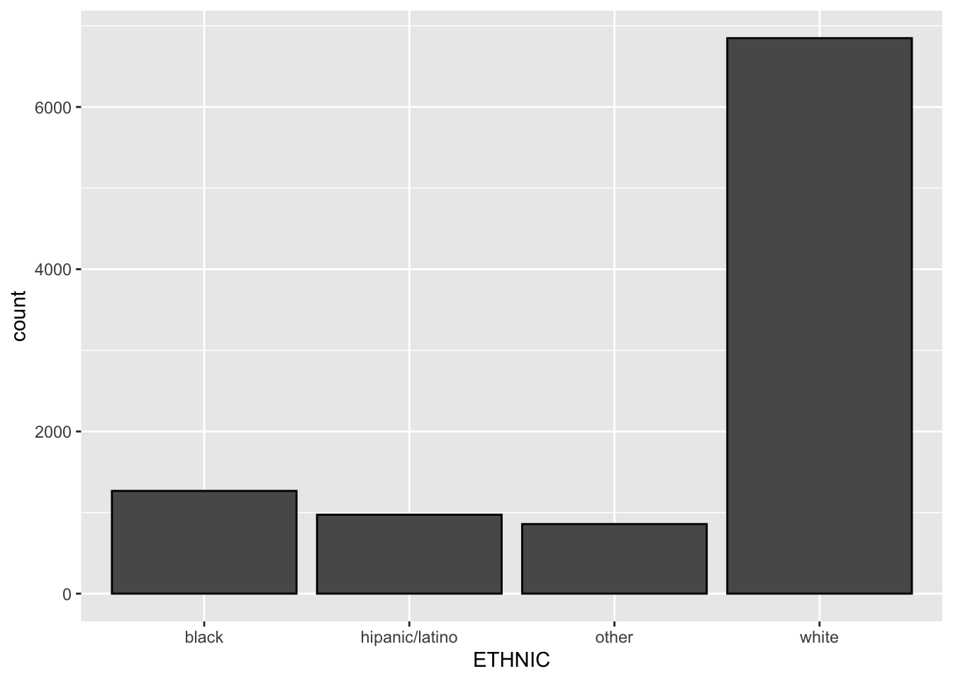
When geom_bar() includes a ‘stat=“summary”’ argument, the bar height will represent a summary statistic calculated for the numeric variable mapped to the plot. The summary statistic is identified by the fun = argument.
tb_chol %>%

    ggplot(mapping = aes(x=sex, y=height)) +

    geom_bar(stat="summary",
             fun = mean)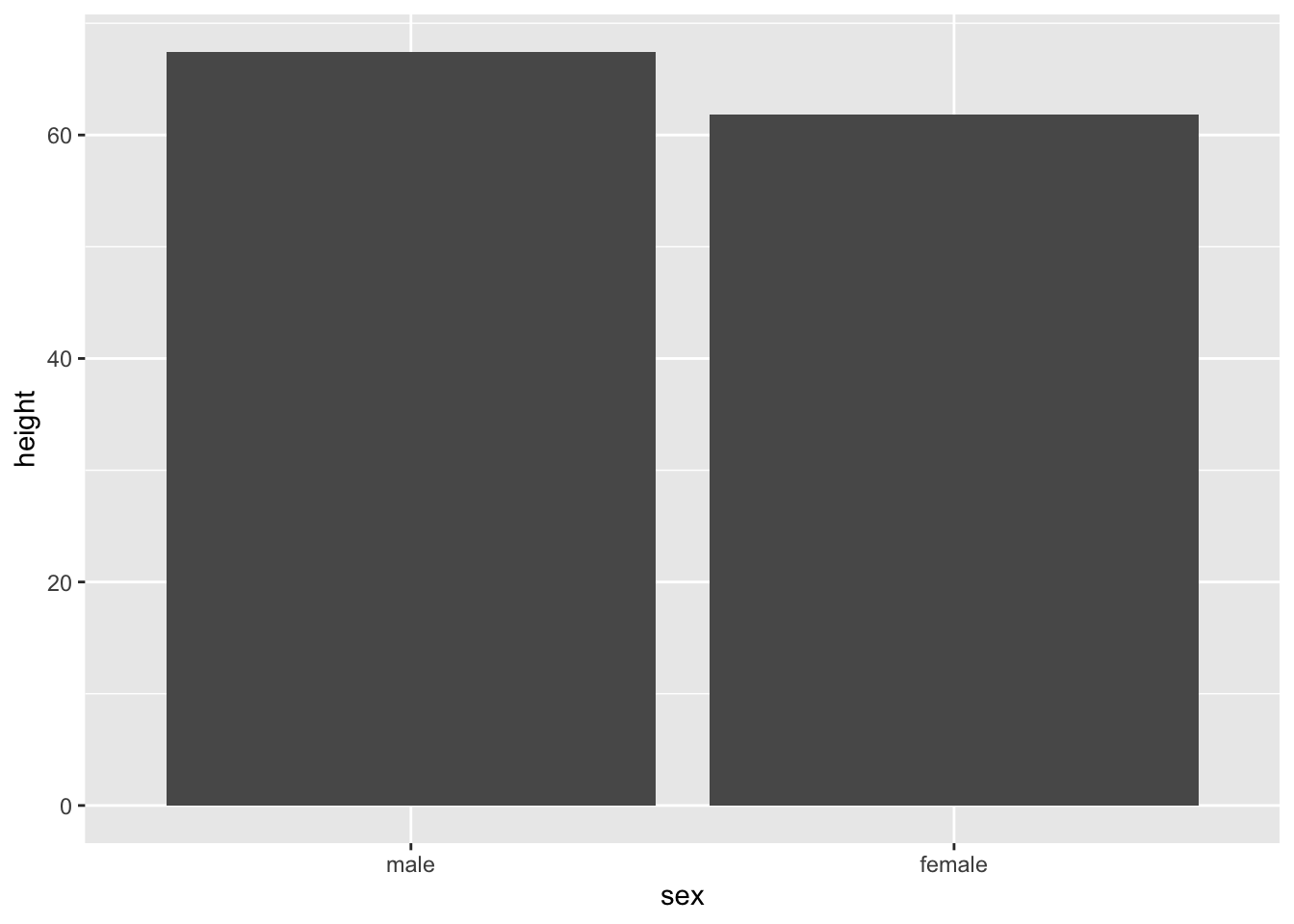
Pointrange graphs emphasize a summary statistics, usually the mean, presented at the levels of a factor variable. The range component usually represents standard error or standard deviation. geom_pointrange() requires a factor variable, numeric variable, and summary statistic. A pointrange graph can show the same information as a bar graph with error bars.
tb_chol %>%

    ggplot(mapping = aes(x=sex, y=height)) +

    geom_pointrange(stat = "summary",
                    fun = mean,
                    fun.min = function(X) mean(X) - sd(X),
                    fun.max = function(X) mean(X) + sd(X))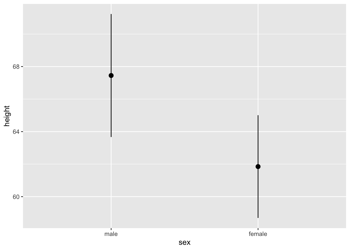
A boxplot shows the 5-number summary (min, first quartile, median, third quartile, max) of a numeric variable and may show outliers. geom_boxplot requires only a numeric variable. If a factor variable is included, side-by-side boxplots will be produced.
tb_chol %>%

    ggplot(mapping = aes(x=timepoint, y=weight)) +

geom_boxplot() 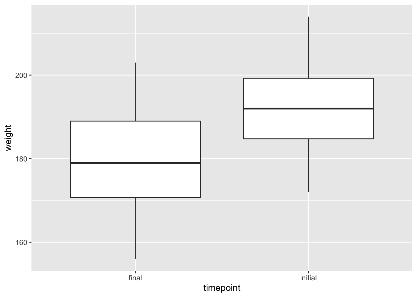
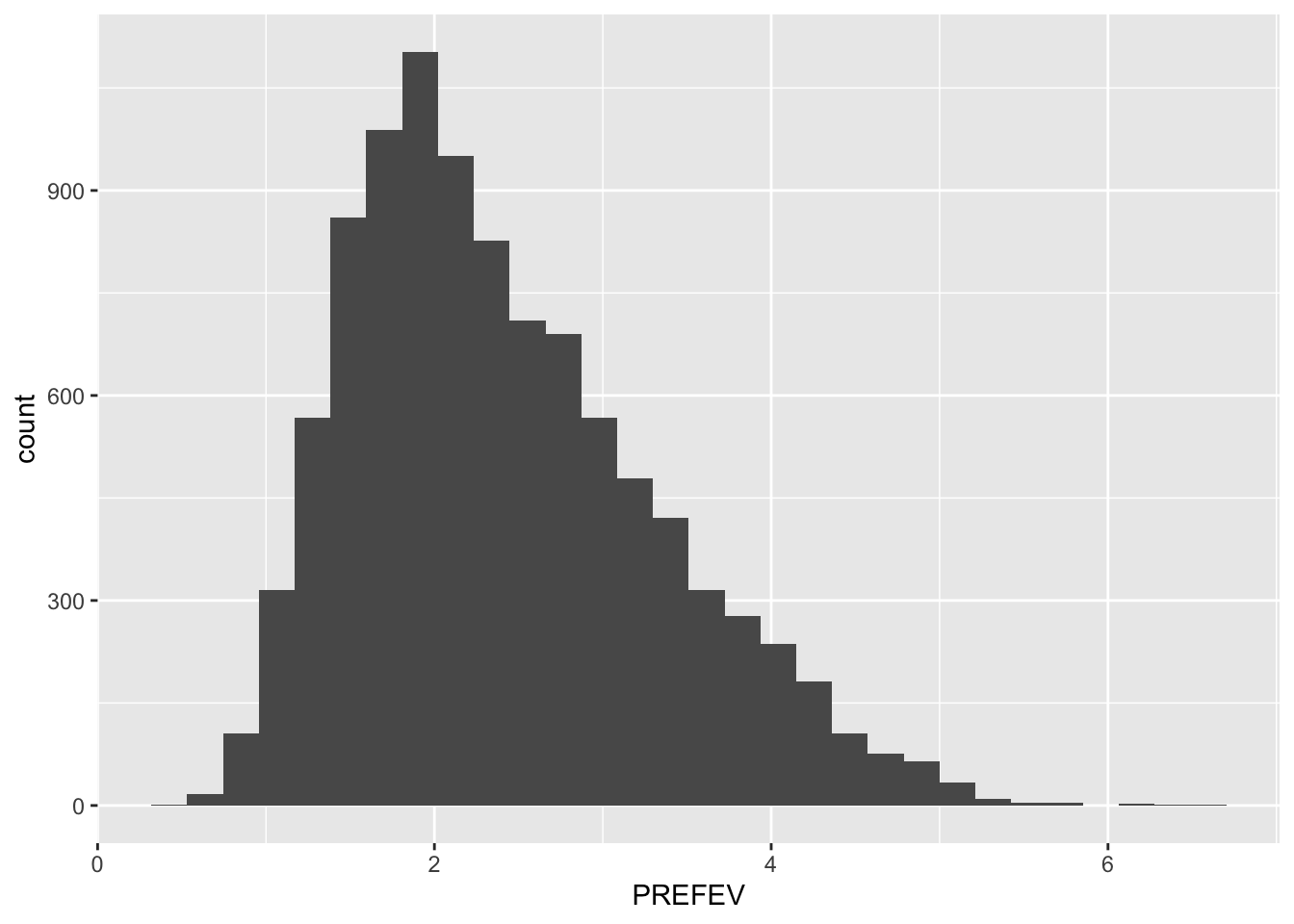
Histograms provide information about center, shape, spread, and outliers of a single numeric variable. geom_histogram requires only a single numeric variable.
tb_camp %>%

    ggplot(mapping = aes(x = PREFEV)) +

    geom_histogram()
`stat_bin()` using `bins = 30`. Pick better value with `binwidth`.Warning: Removed 31 rows containing non-finite outside the scale range
(`stat_bin()`).