Import data for graphing:
In the folded code below we import data from two files, Friends_Cholesterol.csv and CAMP_3280.csv for use in graphing. We fix a few problems during import and name the tibbles tb_chol and tb_camp.
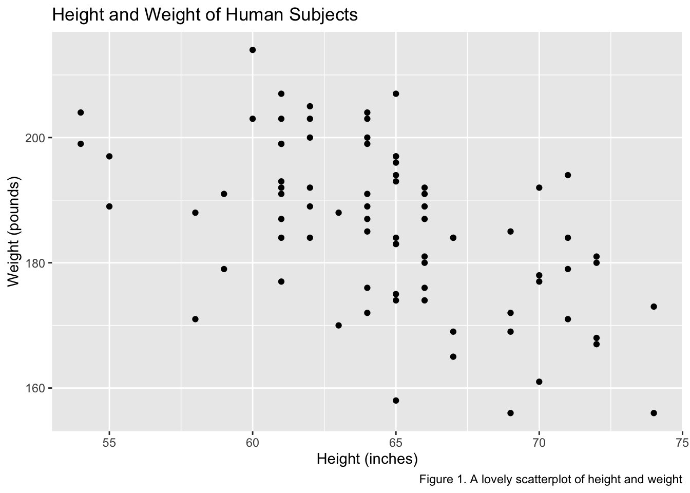
Each argument of labs() adds a custom text label to a plot.
Code
tb_chol %>%ggplot(aes(height, weight)) +geom_point() +labs(x="Height (inches)", y="Weight (pounds)",title ="Height and Weight of Human Subjects",caption ="Figure 1. A lovely scatterplot of height and weight")
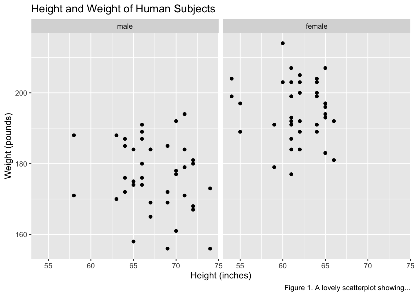
13.0.2 facet_wrap()
Adding the facet_wrap() layer creates a plot for each level of a factor variable passed to the command. Below we use facet_wrap() to control for sex by creating male and female versions of a scatterplot.
Code
tb_chol %>%ggplot(aes(height, weight)) +geom_point() +labs(x="Height (inches)", y="Weight (pounds)",title ="Height and Weight of Human Subjects",caption ="Figure 1. A lovely scatterplot showing...") +facet_wrap(~sex)
13.0.3 Color
Color is one of several tools for adding information to a plot. However, adding color that appears to convey information but is present only for subjective aesthetics is confusing to viewers. Also, some viewers are color-blind. Adding variation in the shape, size, and fill of points or the darkness and line patterns of a fill area can help color-blind viewers see the same information represented by color. When a plot becomes busy with many visual tools, multiple plots with less information may be a better approach.
Plot components with internal areas, such as bars and circles, can be filled with color using the fill = ... argument. Lines and scatterplot symbols without internal areas can be colored using the color = argument. Both lines and areas can be “mapped” to the levels of a factor variable using color or “set” to specific colors. Mappings involve variables, and settings do not. Only mappings are allowed inside the mappings = aes() argument.
R colors can be specified with names or hex codes, and many R color charts are available on the web. The hex codes for CU Boulder’s gold and gray colors are:
CU Gold = #CFB87C
CU Light Gray = #A2A4A3
CU Dark Gray = #565A5C
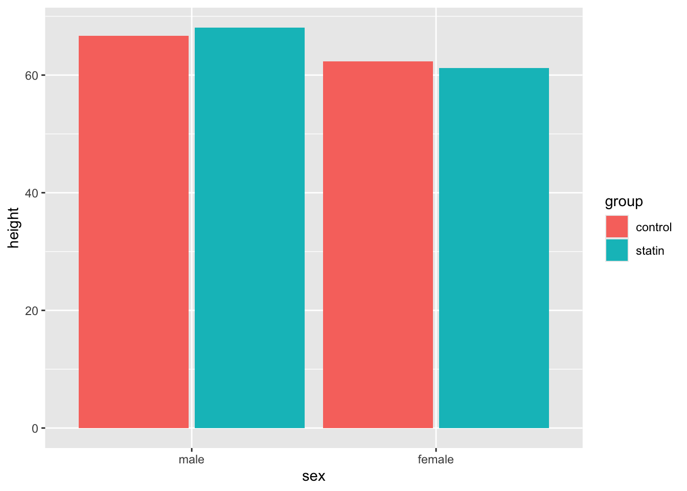
13.0.3.1 Mapping a variable to fill color
Below we use the mapping fill = group to create different colored bars for the control and statin factor levels in our tb_chol data. The default plot shows the fill levels vertically, which is confusing for a bar graph of means. We can override the vertically oriented default using the position = position_dodge(.95) argument within geom_bar, as shown below.
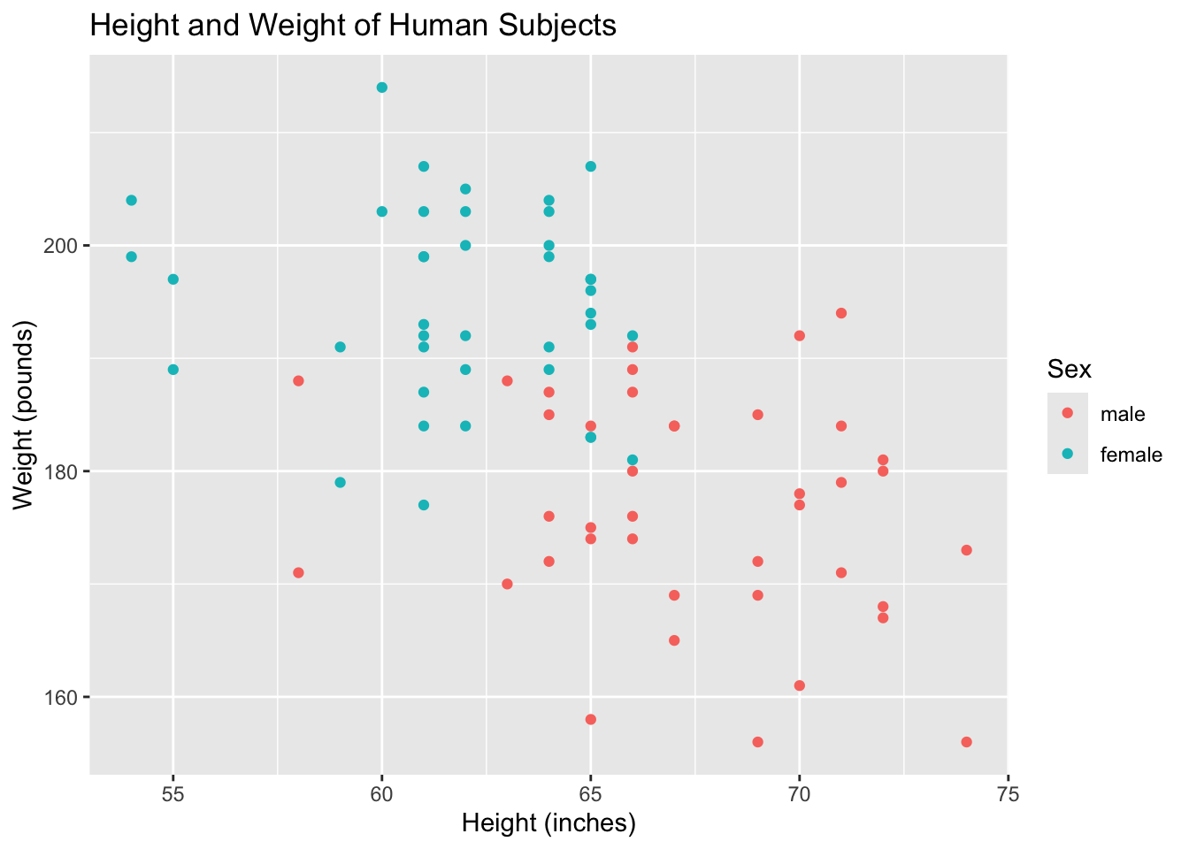
Below we include color = sex to identify male and female points by color. We also add color = "" to the labs layer to change the legend title.
Code
tb_chol %>%ggplot(mapping =aes(x=height, y=weight, color = sex)) +geom_point() +labs(x="Height (inches)", y="Weight (pounds)",title ="Height and Weight of Human Subjects",color ="Sex")
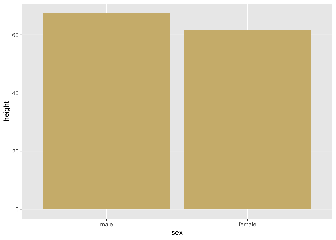
13.0.3.3 Setting fill color
Below we include fill = '#CFB87C' as a setting (outside the mapping argument) to geom_bar() to fill areas with CU Gold.
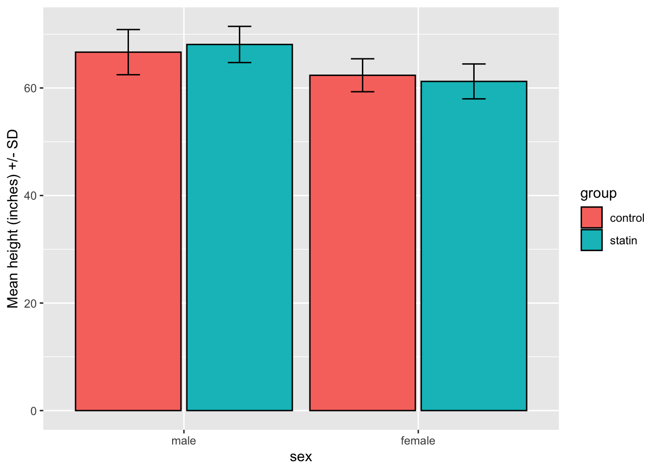
Below we add errorbars with the geom_errorbar() layer. Within geom_errorbar(), the fun.max and fun.min arguments set the position and length of the errorbars. Both use an anonymous function to make the error bars start at mean(height) and extend 1 standard deviation above (fun.max) and below (fun.min) the mean(height). In the anonymous functions, “X” identifies the numeric variable mapped to ggplot, height.
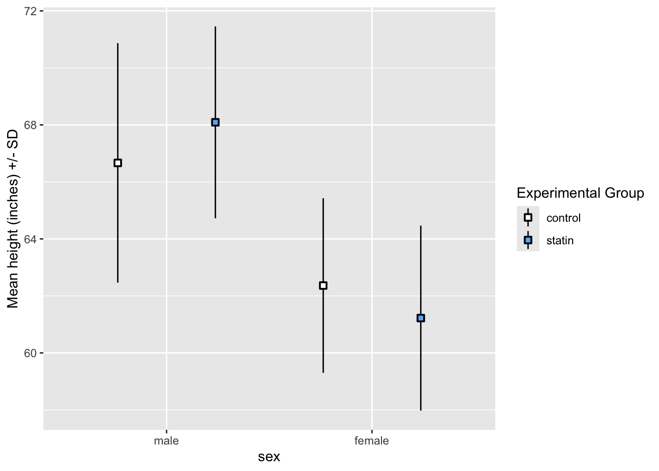
ggplot2 chooses colors and creates legends for variables that are mapped to the fill = and color = arguments. Default colors and legend text can be changed using the scale_fill_manual = and scale_color_manual = arguments. The legend titles can be customized using fill ="<new title>" and color = "<new title>" to the labs layer.
The plot below maps group to a fill = argument. The default colors and text are changed by the scale_fill_manual = argument. We avoid stacking the points and errorbars vertically within the levels of sex by using the position = position_dodge(.95) argument.
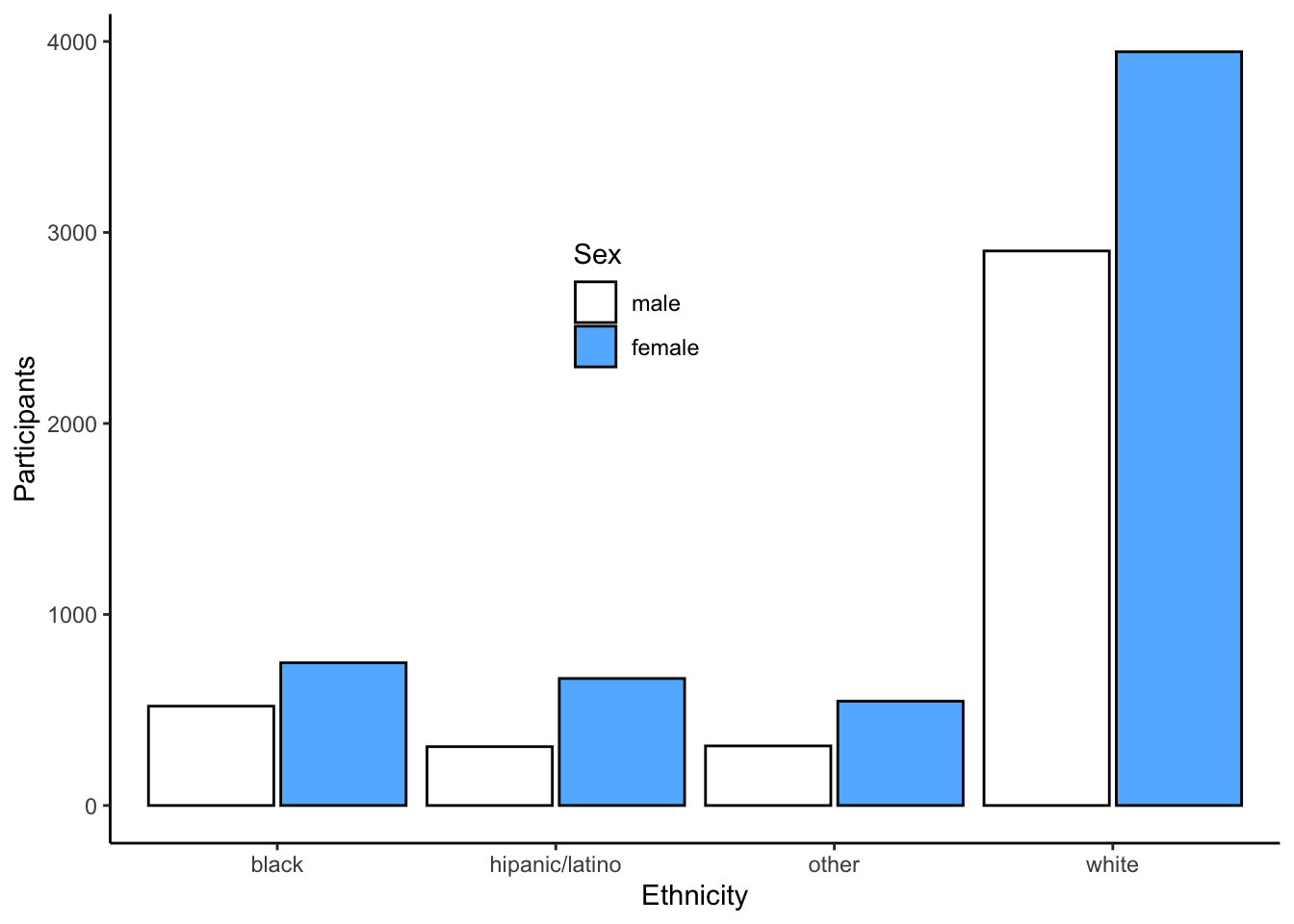
themes() layers allow customization of the background color, gridlines, axis lines, font size, text orientation, legend position, and many more plot characteristics. Theme details can be saved as an object and used for many plots, as shown below. Many custom themes exist and can be copied from the “Complete themes” vignette. Below we use theme_classic() to produce a plot with minimal formatting and another theme layer to control legend position.
Warning: A numeric `legend.position` argument in `theme()` was deprecated in ggplot2
3.5.0.
ℹ Please use the `legend.position.inside` argument of `theme()` instead.
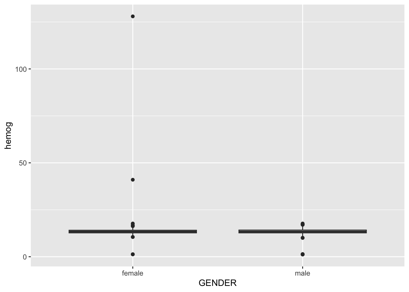
13.0.8 Outliers and Axis limits
Outliers in boxplots, scatterplots, and other plots can compress plots to the point where important details are impossible to see. Details of the boxplots below are completely obscured by the compression caused by outliers.
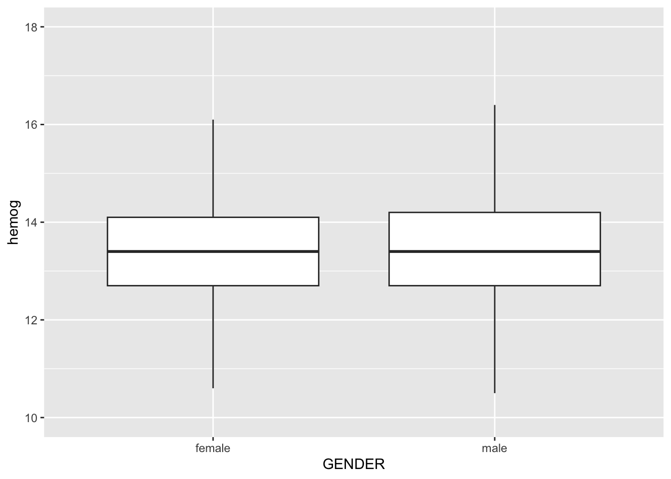
Removing the outliers from the data will change summary statistics and may not be justified. One approach to minimizing the visual affect of outliers is to use the outlier.shape = NA argument (when available) and manualy control the limits of the plot axis. Below we employ both of these methods to show boxplots without removing outliers from the data.
# Customizing plots**Import data for graphing:**\In the folded code below we import data from two files, Friends_Cholesterol.csv and CAMP_3280.csv for use in graphing. We fix a few problems during import and name the tibbles tb_chol and tb_camp.```{r}#| message: false#| output: false#| code-fold: truelibrary(tidyverse)rm(list =ls())tb_chol <-read_csv(file ="data/Friends_Cholesterol.csv", col_types ="cnfnfnnnnnn") %>%rename(first_name = name,sex = gender) %>%mutate(sex =fct_recode(sex, 'male'='0', 'female'='1'),group =fct_recode(group,'control'='0', 'statin'='1')) %>%pivot_longer(cols =6:11,names_sep ="_", names_to =c(".value", "timepoint")) %>%mutate(timepoint =factor(timepoint),timepoint =fct_recode(timepoint,"initial"="i","final"="f"))tb_camp <-read_csv("data/CAMP_3280.csv") %>%mutate(ETHNIC =fct_recode(ETHNIC,"black"="b","white"="w","hipanic/latino"="h","other"="o"),GENDER =as.factor(GENDER),GENDER =fct_recode(GENDER, "female"="0", "male"="1"))```### Labels - axis, title, captionEach argument of `labs()` adds a custom text label to a plot.```{r}tb_chol %>%ggplot(aes(height, weight)) +geom_point() +labs(x="Height (inches)", y="Weight (pounds)",title ="Height and Weight of Human Subjects",caption ="Figure 1. A lovely scatterplot of height and weight")```### facet_wrap()Adding the `facet_wrap()` layer creates a plot for each level of a factor variable passed to the command. Below we use `facet_wrap()` to control for sex by creating male and female versions of a scatterplot.```{r}tb_chol %>%ggplot(aes(height, weight)) +geom_point() +labs(x="Height (inches)", y="Weight (pounds)",title ="Height and Weight of Human Subjects",caption ="Figure 1. A lovely scatterplot showing...") +facet_wrap(~sex)```### ColorColor is one of several tools for adding information to a plot. However, adding color that appears to convey information but is present only for subjective aesthetics is confusing to viewers. Also, some viewers are color-blind. Adding variation in the shape, size, and fill of points or the darkness and line patterns of a fill area can help color-blind viewers see the same information represented by color. When a plot becomes busy with many visual tools, multiple plots with less information may be a better approach.Plot components with internal areas, such as bars and circles, can be filled with color using the `fill = ...` argument. Lines and scatterplot symbols without internal areas can be colored using the `color =` argument. Both lines and areas can be "mapped" to the levels of a factor variable using color or "set" to specific colors. Mappings involve variables, and settings do not. Only mappings are allowed inside the `mappings = aes()` argument.R colors can be specified with names or hex codes, and many [R color charts](https://rstudio-pubs-static.s3.amazonaws.com/3486_79191ad32cf74955b4502b8530aad627.html) are available on the web. The hex codes for CU Boulder's gold and gray colors are:- CU Gold = #CFB87C- CU Light Gray = #A2A4A3- CU Dark Gray = #565A5C#### Mapping a variable to fill colorBelow we use the mapping `fill = group` to create different colored bars for the control and statin factor levels in our tb_chol data. The default plot shows the fill levels vertically, which is confusing for a bar graph of means. We can override the vertically oriented default using the `position = position_dodge(.95)` argument within geom_bar, as shown below.```{r}tb_chol %>%ggplot(mapping =aes(x=sex, y=height, fill=group)) +geom_bar(stat="summary",fun = mean,position =position_dodge(.95)) ```#### Mapping a variable to line/point colorBelow we include `color = sex` to identify male and female points by color. We also add `color = ""` to the labs layer to change the legend title.```{r}tb_chol %>%ggplot(mapping =aes(x=height, y=weight, color = sex)) +geom_point() +labs(x="Height (inches)", y="Weight (pounds)",title ="Height and Weight of Human Subjects",color ="Sex")```#### Setting fill colorBelow we include `fill = '#CFB87C'` as a setting (outside the mapping argument) to `geom_bar()` to fill areas with CU Gold.```{r}tb_chol %>%ggplot(mapping =aes(x=sex, y=height)) +geom_bar(stat="summary",fun = mean,fill='#CFB87C')```#### Setting line/point colorBelow we include `color = "black"` as a setting (outside the mapping argument) to set lines in `geom_bar()` to black.```{r}tb_chol %>%ggplot(mapping =aes(x=sex, y=height)) +geom_bar(stat="summary",fun = mean,fill='#CFB87C',color='black')```### Error BarsBelow we add errorbars with the `geom_errorbar()` layer. Within `geom_errorbar()`, the `fun.max` and `fun.min` arguments set the position and length of the errorbars. Both use an anonymous function to make the error bars start at mean(height) and extend 1 standard deviation above (fun.max) and below (fun.min) the mean(height). In the anonymous functions, "X" identifies the numeric variable mapped to ggplot, height.```{r}tb_chol %>%ggplot(mapping =aes(x=sex, y=height, fill=group)) +geom_bar(stat="summary",fun = mean, # bar height equals mean(height)position =position_dodge(.95), # side-by-side barscolor='black') +geom_errorbar(stat ="summary",fun = mean,fun.max =function(X) mean(X) +sd(X),fun.min =function(X) mean(X) -sd(X),position =position_dodge(.95), width=0.2) +labs(x ="sex", y ='Mean height (inches) +/- SD')```### Order factor levels```{r}tb_chol %>%mutate(timepoint =ordered(timepoint, levels =c("initial", "final"))) %>%ggplot(mapping =aes(x=timepoint, y=weight)) +geom_boxplot() ```### Legend colors & textggplot2 chooses colors and creates legends for variables that are mapped to the `fill =` and `color =` arguments. Default colors and legend text can be changed using the `scale_fill_manual =` and `scale_color_manual =` arguments. The legend titles can be customized using `fill ="<new title>"` and color = `"<new title>"` to the labs layer.The plot below maps group to a `fill =` argument. The default colors and text are changed by the `scale_fill_manual =` argument. We avoid stacking the points and errorbars vertically within the levels of sex by using the `position = position_dodge(.95)` argument.```{r}tb_chol %>%ggplot(mapping =aes(x=sex, y=height, fill=group)) +geom_pointrange(stat ="summary",fun = mean, fun.min =function(X) mean(X) -sd(X),fun.max =function(X) mean(X) +sd(X),shape =22,position =position_dodge(.95)) +labs(x ="sex", y ='Mean height (inches) +/- SD',fill ="Experimental Group") +scale_fill_manual(values =c('white', 'steelblue1'), labels =c("control", "statin"))```### Themes`themes()` layers allow customization of the background color, gridlines, axis lines, font size, text orientation, legend position, and many more plot characteristics. Theme details can be saved as an object and used for many plots, as shown below. Many custom themes exist and can be copied from the "[Complete themes](https://ggplot2.tidyverse.org/reference/ggtheme.html)" vignette. Below we use `theme_classic()` to produce a plot with minimal formatting and another theme layer to control legend position.```{r}tb_camp %>%ggplot() +geom_bar(mapping =aes(x=ETHNIC, fill = GENDER),position =position_dodge(.95),color ='black') +scale_fill_manual(name ="Sex",values =c("white", "steelblue1"),labels =c("male", "female")) +labs(x ="Ethnicity",y ="Participants") +theme_classic() +theme(legend.position =c(.45,.65))```### Outliers and Axis limitsOutliers in boxplots, scatterplots, and other plots can compress plots to the point where important details are impossible to see. Details of the boxplots below are completely obscured by the compression caused by outliers.```{r}tb_camp %>%filter(!is.na(hemog)) %>%ggplot(mapping =aes(x=GENDER, y=hemog)) +geom_boxplot() ```Removing the outliers from the data will change summary statistics and may not be justified. One approach to minimizing the visual affect of outliers is to use the `outlier.shape = NA argument` (when available) and manualy control the limits of the plot axis. Below we employ both of these methods to show boxplots without removing outliers from the data.```{r}tb_camp %>%filter(!is.na(hemog)) %>%ggplot(mapping =aes(x=GENDER, y=hemog)) +geom_boxplot(outlier.shape =NA) +coord_cartesian(ylim =c(10, 18))```